


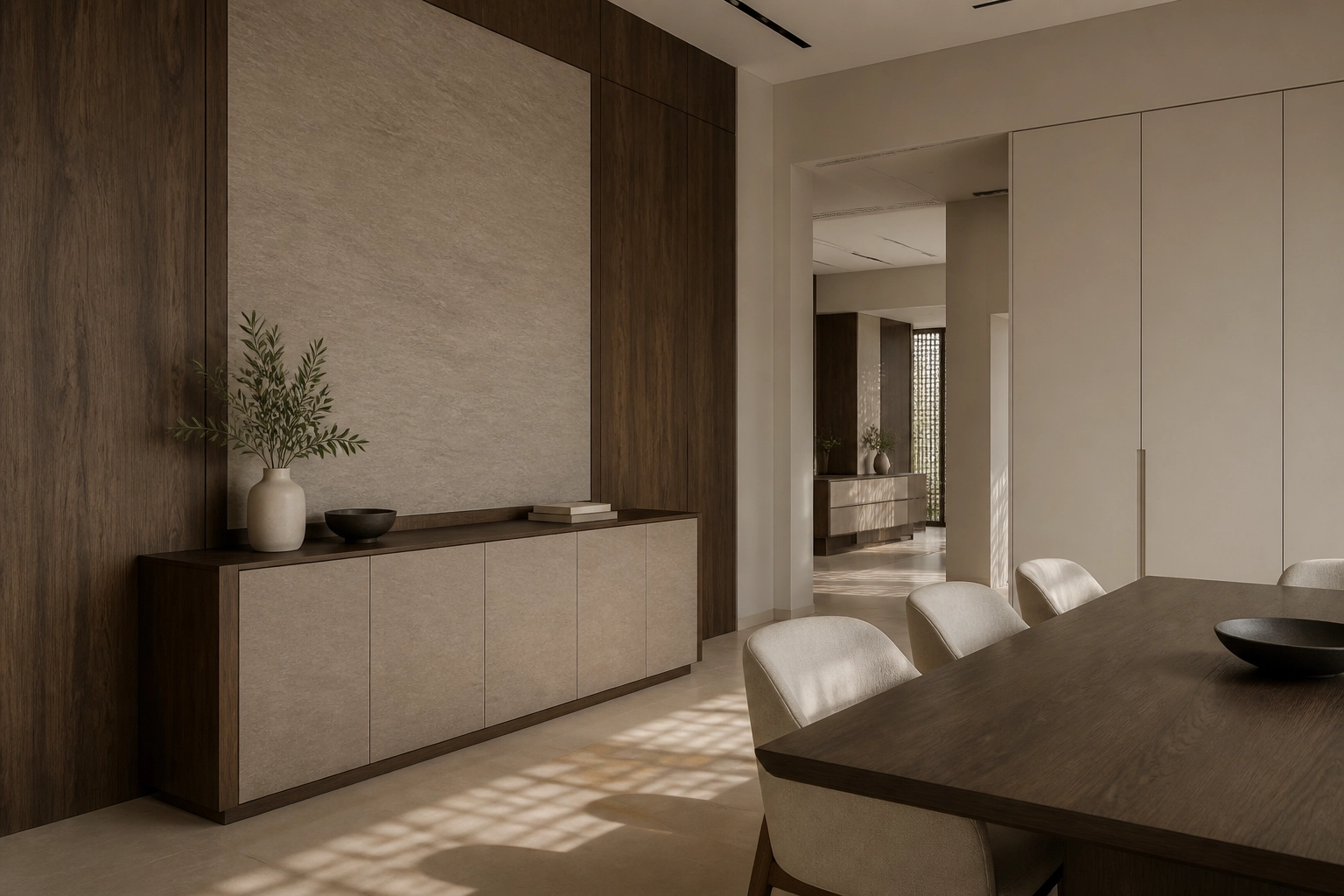
How to Build a Balanced Interior Palette with Wood, Stone and Neutral Tones
Begin with one material that sets the direction
Balanced interiors rarely begin with a large collection of unrelated finishes.
They usually start with one material that establishes the atmosphere of the space. It might be a warm walnut, a pale oak, a stone-inspired surface or a quiet architectural neutral.
Once that dominant material is selected, the remaining palette can be built around it.
Create contrast without creating competition
Contrast gives an interior definition, but too many competing surfaces can make a space feel fragmented.
A darker woodgrain can sit confidently beside a pale mineral surface. Lighter woods can work naturally with warm greys, sand tones and soft off-whites. Solid colours can provide visual rest between stronger grain and stone patterns.
The objective is not to make every material look similar. It is to give each one a clear role.
A sophisticated material palette is created through hierarchy, not through the number of finishes used.
Wood introduces pattern and direction. Stone and mineral effects provide visual weight. Solid colours create quieter areas that allow stronger surfaces to stand out.
When these roles are understood, the palette becomes easier to control.
This approach is particularly effective across fitted interiors, where cabinetry, wardrobes and wall elements may occupy a significant portion of the room. Repeating a smaller group of coordinated materials often creates a stronger sense of continuity than introducing a different finish on every surface.
Let light become part of the palette
Colour should never be considered independently from light.
A warm neutral may appear softer under evening lighting and more defined in daylight. Darker woodgrains can become richer under controlled illumination, while pale surfaces can shift noticeably depending on neighbouring materials.
Texture also influences how colour is experienced. Matt and low-gloss surfaces tend to feel quieter, while deeper textures introduce shadow and emphasize surface structure.
These differences are difficult to understand from a colour reference alone.
Repeat materials to create continuity
A successful palette does not need to remain identical from room to room.
Instead, selected materials can reappear in different proportions. A walnut used prominently in a kitchen might return as a smaller detail within a living area. A neutral selected for wardrobes could appear again in fitted cabinetry elsewhere.
This creates a recognizable material language without making every space feel the same.
The result is an interior that feels composed rather than assembled – with enough variation to create interest and enough repetition to create continuity.
Stay closer to the world of surfaces
Receive selected Crownsig updates on decorative surfaces, material ideas, design perspectives and new product introductions.
* Add notice about your Privacy Policy here.