


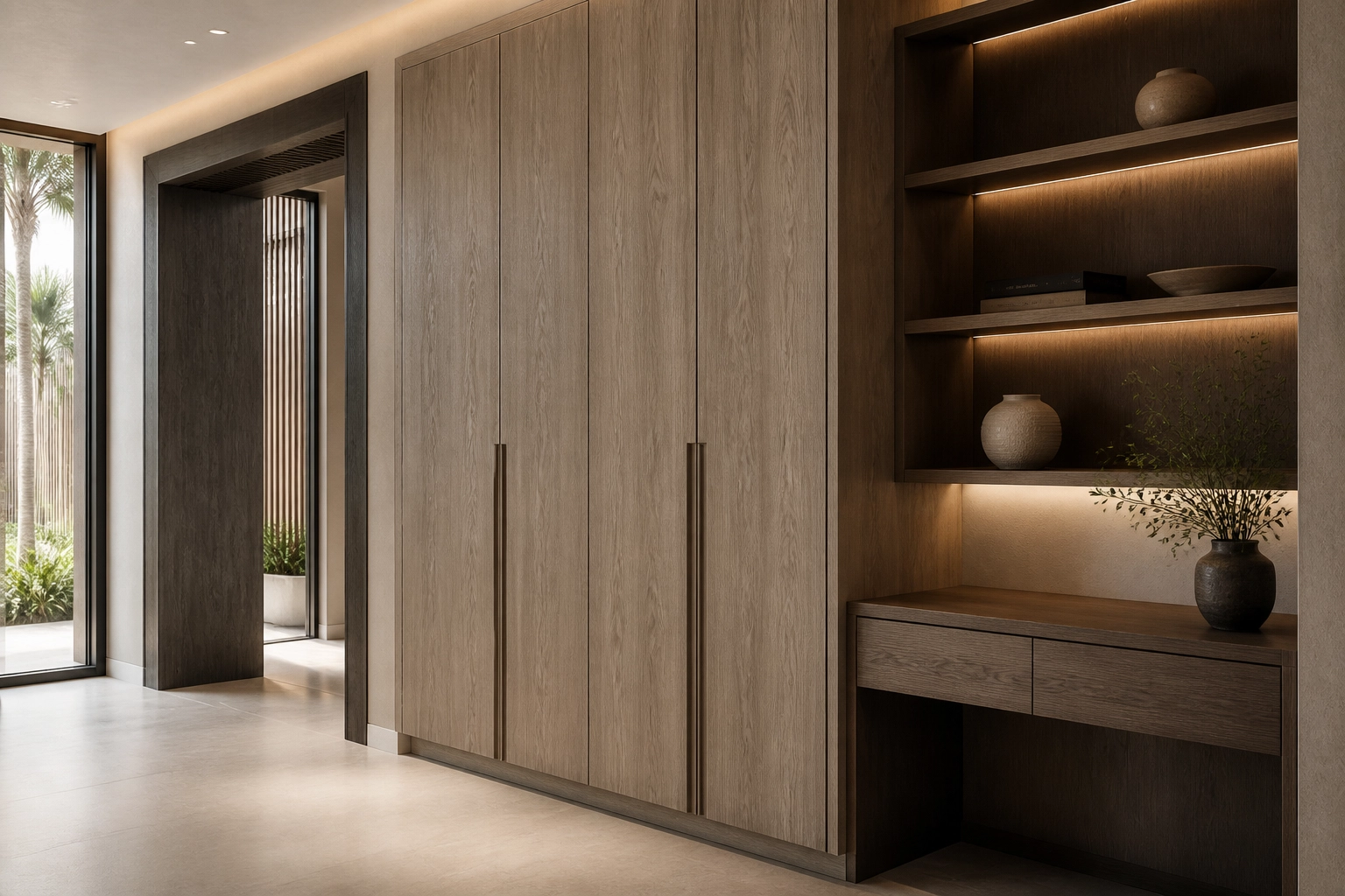
How to Choose Decorative Wood Surfaces for Interior Projects
Start with the space, not the sample
Choosing a decorative surface often begins with an immediate visual reaction. A colour feels right, a grain creates warmth, or a texture gives the material the character a project needs.
But a surface viewed as a small sample tells only part of the story.
Once applied to cabinetry, wardrobes, furniture or full-height joinery, its scale, direction and relationship with surrounding materials become much more important. A successful selection therefore begins by understanding what the surface needs to achieve within the space.
Consider color, grain and texture together
Wood-inspired surfaces should not be selected by colour alone.
Grain direction influences how an element is perceived. A linear structure can reinforce height or length, while a more expressive pattern introduces movement and character. Texture adds another dimension by changing how light travels across the surface.
Two surfaces with similar color can create very different impressions when their grain and texture are different.
The right surface is not simply the one that looks best as a sample. It is the one that works best in the space.
Scale matters just as much. A pronounced grain that appears subtle on a small swatch may become visually dominant when repeated across several metres of cabinetry. Conversely, a quiet surface may reveal greater sophistication when used across a large architectural element.
The surrounding palette should also be considered from the beginning. Flooring, stone, fabrics, metals and painted finishes all influence how a decorative surface is perceived. Rather than evaluating every material independently, look at the interior as one composition.
Understand how light changes the material
A decorative surface does not look the same under every lighting condition.
Natural daylight can reveal undertones and grain details that appear differently under warmer artificial lighting. Surface texture also affects reflection. A matt finish may absorb more light and appear quieter, while deeper textures can introduce additional shadow and contrast.
Digital visualization is useful at this stage because it allows surfaces to be compared within a complete interior rather than in isolation. It can help eliminate unsuitable options and establish the direction of the material palette before physical samples are requested.
Confirm the physical product behind the design
The visual surface is only one part of the material decision.
Before final approval, the physical product carrying that design should also be understood. Product format, dimensions, thickness, substrate and relevant coordinating components may all influence whether a particular selection is appropriate for its intended application.
This is particularly important for architects, designers, joineries and manufacturers. Connecting the visual selection with the correct product transforms an attractive surface into a workable specification.
Crownsig is built around that connection – helping customers move from discovery and visualization towards physical sampling, product understanding and quotation with greater clarity.
Stay closer to the world of surfaces
Receive selected Crownsig updates on decorative surfaces, material ideas, design perspectives and new product introductions.
* Add notice about your Privacy Policy here.