

RETAIL & F&B INTERIORS
Surfaces that turn commercial spaces into memorable experiences
From boutique displays and café counters to restaurants and evening venues
Retail and F&B interiors are experienced quickly and repeatedly. Materials must establish character at first sight while creating a coherent relationship across counters, displays, walls, seating and service elements.
Across commercial destinations in Saudi Arabia and the GCC, these environments often operate from daylight into late evening. Their material palettes need to retain depth, balance and identity under changing light and across different customer experiences.
Crownsig helps designers, operators and manufacturers coordinate woodgrains, mineral decors and architectural colours across complete retail and hospitality concepts.
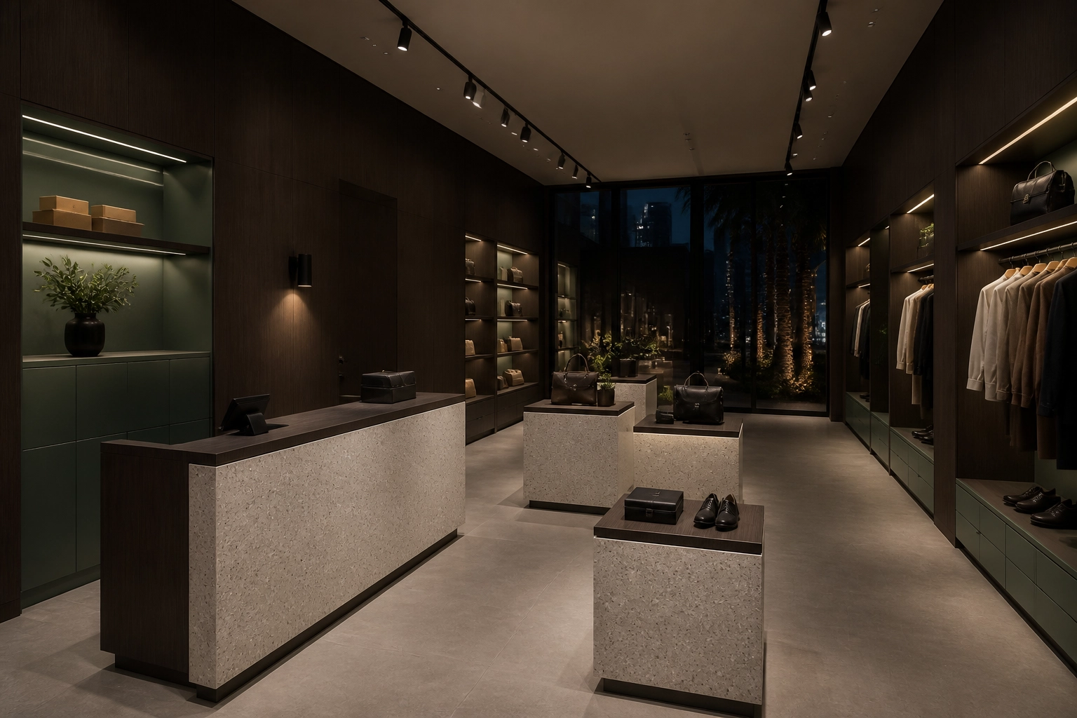
Retail & F&B – Boutique Retail – Veda – Espresso Linear + Vevo – Light Terrazzo + Eucalyptus Green
CAFÉS & SERVICE COUNTERS
A counter that defines the customer experience
In a café, the service counter is both a working element and the visual anchor of the interior. Front panels, display zones, back bars and overhead joinery need a clear material relationship.
Veda – Espresso Linear adds rhythm and depth, Vevo – Light Terrazzo introduces a lighter mineral surface, and Eucalyptus Green gives the palette a recognisable accent.
Together, the surfaces create a contemporary café setting with warmth, contrast and a strong identity.
CONNECTED SERVICE ZONES
A coordinated material treatment connects the customer-facing counter, product display, back bar and surrounding joinery.
BALANCED CONTRAST
Dark linear wood, light terrazzo and muted green create distinction without overwhelming the products on display.
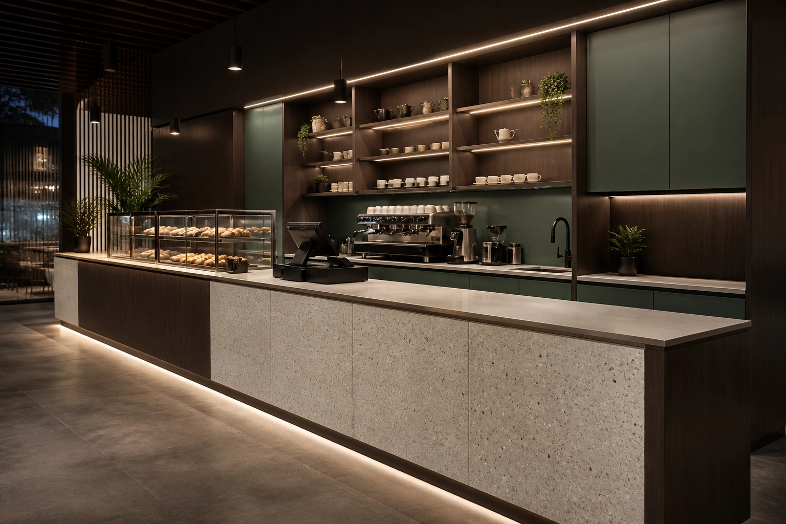
Retail & F&B – Cafe Counter – Veda – Espresso Linear + Vevo – Light Terrazzo + Eucalyptus Green
RESTAURANTS
One material language from arrival to dining
Restaurant interiors bring many applications into one customer journey – entrance features, host stations, dining areas, wall panelling, banquettes and service joinery.
Continuing the same Veda, Vevo and Eucalyptus palette across these elements helps the environment feel intentional while allowing each zone to maintain its own function.
Variation can come through proportion, lighting and application rather than introducing unrelated materials throughout the space.
ZONED BY MATERIAL
Changes in scale and placement help distinguish arrival, dining and service areas while maintaining one coherent identity.
EVENING CHARACTER
Dark timber, light terrazzo and muted green retain their depth and clarity under controlled restaurant lighting.
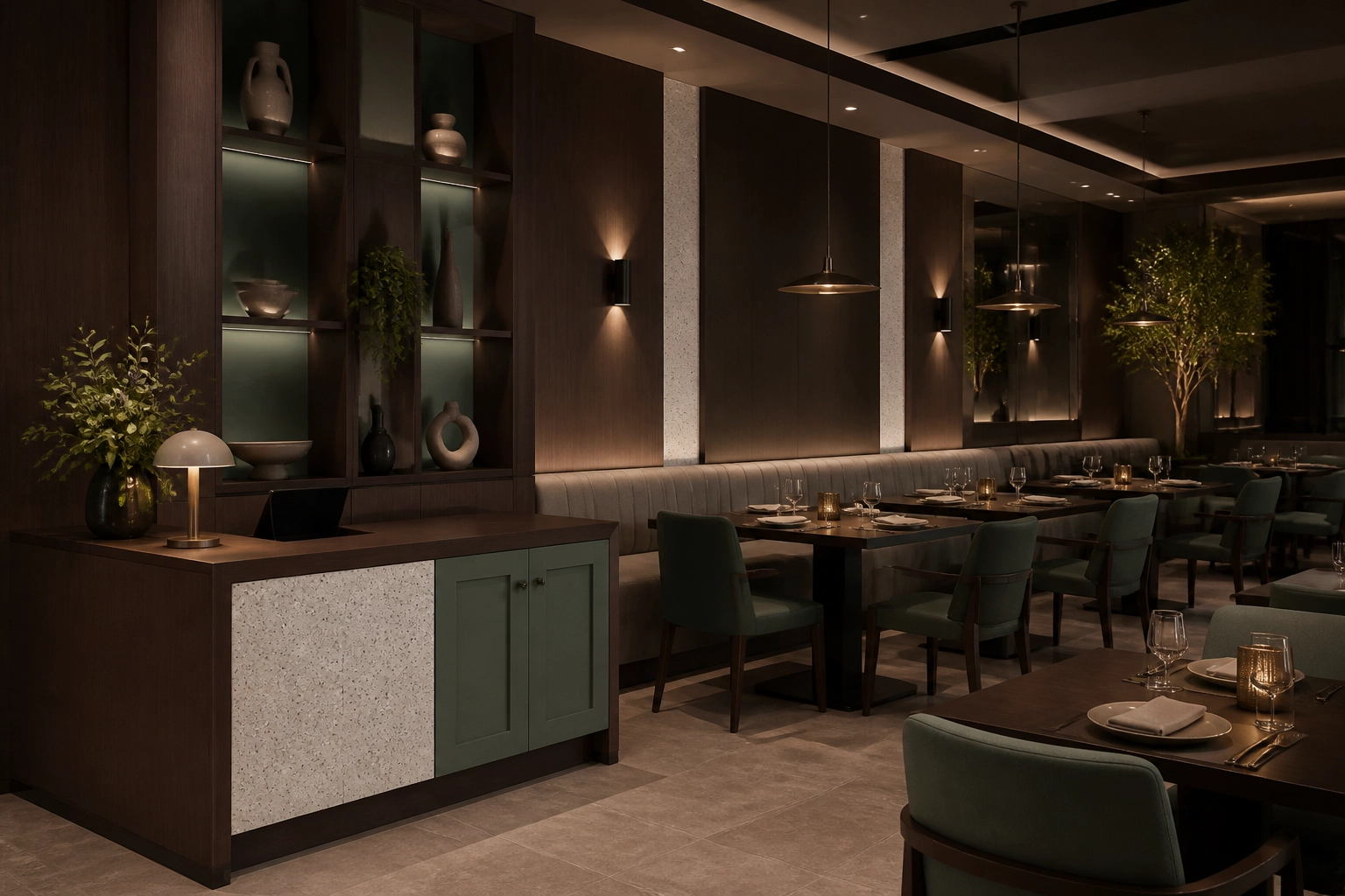
Retail & F&B – Restaurant – Veda – Espresso Linear + Vevo – Light Terrazzo + Eucalyptus Green
LUXURY RETAIL
A refined setting that keeps attention on the product
Jewellery and fragrance boutiques require an interior with presence, but the material palette should support the merchandise rather than compete with it.
Sienna Walnut Taupe brings warmth to display cabinetry and wall joinery. Cascade White Marble adds brightness to focal surfaces, while Linen Beige creates a softer transition across larger planes.
Together, the surfaces form a calm, premium setting for illuminated display, consultation and customer service.
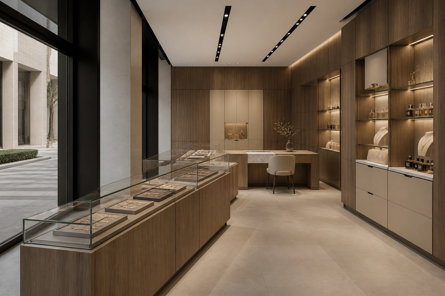
Jewellery and Perfume Boutique – Sienna Walnut Taupe + Cascade White Marble + Linen Beige
BAKERIES & EVERYDAY F&B
Warm materials for an inviting everyday experience
Artisan bakeries depend on warmth, familiarity and clear presentation. The materials around the display counter should frame the product while giving the interior a distinctive character.
Harvest Wood Light brings natural warmth, Petit Granite – Warm Sand provides a grounded mineral note, and Golden Sand adds a subtle accent.
Together, the palette creates a bright and approachable environment suited to morning trade, informal dining and repeated daily use.
PRODUCT-LED DISPLAY
A restrained palette keeps attention on the food presentation while giving counters and shelving a crafted character.
WARM, APPROACHABLE DETAIL
Light wood and sand-toned surfaces create a welcoming atmosphere without becoming overly decorative.
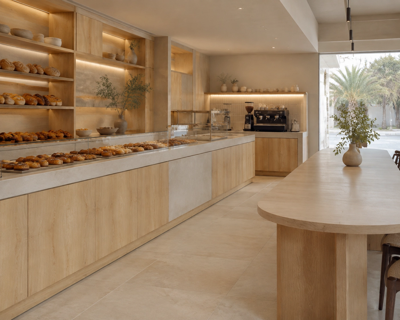
Artisan Bakery – Harvest Wood Light + Petit Granite Warm Sand + Golden Sand
EVENING DINING & BAR
A darker palette with depth and atmosphere
Evening venues rely on controlled light and material contrast to establish atmosphere. Bars, back displays, wall panelling and fitted seating need enough depth to hold the interior together after dark.
Nocturne Wood creates a dark timber foundation. Basima – Black Marble introduces movement and a premium focal surface, while Jet Black reinforces shadow lines and architectural definition.
Together, the palette creates an immersive and composed setting suited to restaurant bars, lounges and late-evening dining.
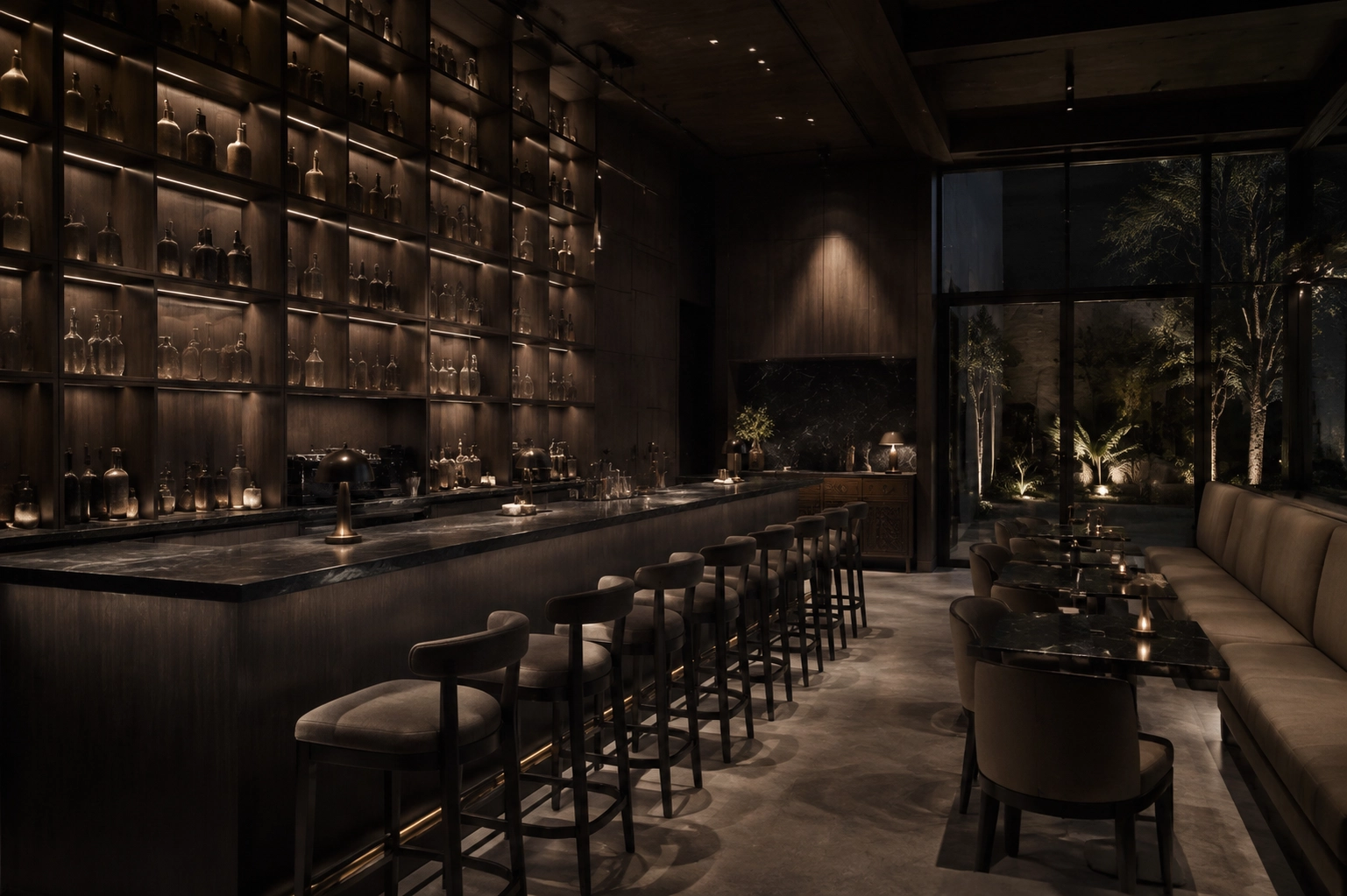
Restaurant Bar – Nocturne Wood + Basima Black Marble + Jet Black
CURATED PALETTES
Coordinated surface combinations for boutiques, cafés, restaurants and customer-facing environments.
APPLICATION GUIDANCE
Support in matching materials to displays, counters, wall panelling, storage and fitted furniture.
PHYSICAL SAMPLES
Material samples for evaluating colour, grain and finish under the project’s intended lighting.
SPECIFICATION SUPPORT
Clear product information to support design decisions, procurement and commercial joinery production.